Project #3 - Conceptual & Physical Design
STORYBOARD
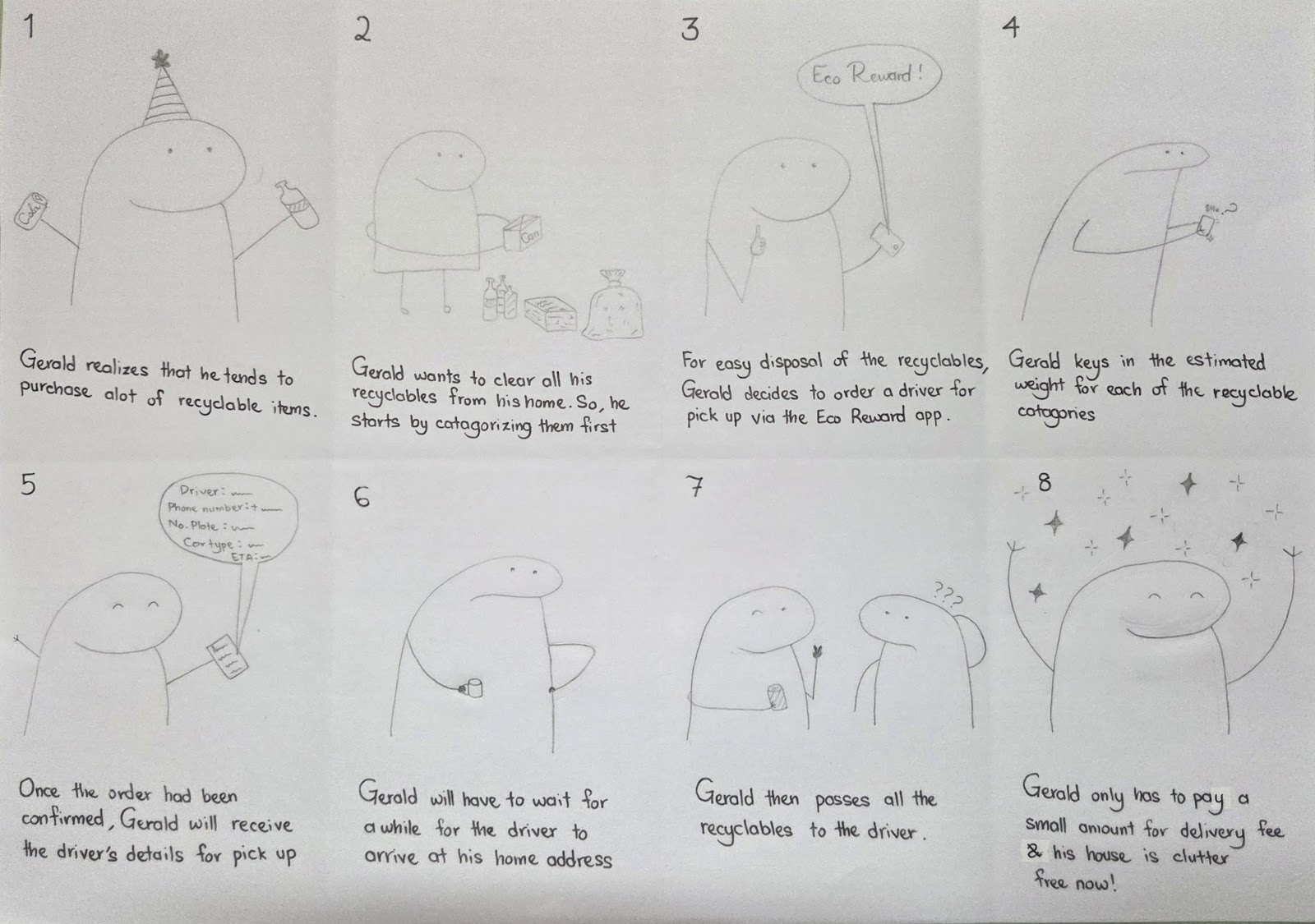
Task 1: Ordering a Bulk Waste Pickup using the Eco-Reward App
Task 2: Finding Nearest Eco-Reward Bin on Eco-Reward App
Task 3: Advance Booking Pickup for Bulk Waste using Eco-Reward
CRAZY 8 METHOD
Alternative Design 1 - Ida Yatullailiyeh
Alternative Design 2 - Parthiv
Alternative Design 3 - Mikael Haqimi
Alternative Design 4 - Muhammad Firdaus
Alternative Design 5 - Gavenesh
VOTING FOR THE BEST IDEA :
WIREFRAMES
Task 1: Ordering a Bulk Waste Pickup using the Eco-Reward App


Shneiderman’s 8 Golden Rules
Rule 1: Strive for consistency – The interface consistently uses familiar icons and layouts across all screens. Common visual elements such as the home icon, back arrow, and “Proceed” buttons maintain uniformity, allowing users to navigate the system with confidence.
Rule 3: Offer informative feedback – Screens such as “Your Driver is Here!” and “Goods are Being Loaded” provide timely and context-appropriate feedback. Additionally, the final “Done!” screen with payment confirmation reassures users that their contribution has been acknowledged and processed.
Rule 4: Design dialogs to yield closure – The final confirmation screen includes a clear message indicating successful payment and processing. This acts as a definitive endpoint, providing users with closure after completing their recycling task.
Rule 6: Permit easy reversal of actions – A back arrow is present at the top of most screens, enabling users to revisit and modify previous inputs without needing to restart the entire process. This supports user confidence and flexibility.
Rule 7: Support internal locus of control – Users are in charge of each action, from selecting types and quantities of recyclables to confirming their pickup location. The interface responds to user input in real time, reinforcing a sense of control over the process.
Rule 8: Reduce short-term memory load – Each screen is focused on a single task (e.g., entering weights, confirming location), reducing the amount of information users need to remember. The sequential flow helps users progress step-by-step without cognitive overload.
Gestalt Principles
Proximity – Related elements are placed close together to indicate they serve a shared purpose. For example, in the “Choose Your Goods” screen, all item icons and their corresponding weight fields are grouped closely, signaling they belong to the same selection activity.
Similarity – Consistent use of visual design, such as shape and icon style, helps users easily identify related components. For instance, all the action buttons (“Proceed”, “Confirm”) share a similar rectangular shape and placement, reinforcing their functional similarity across screens.
Figure-Ground – Key interactive elements like icons, buttons, and data fields clearly stand out from the simple white background, helping users quickly distinguish actionable items from non-interactive content.
Closure – The final confirmation screen that displays “Done!” and a payment deposit message gives users a sense of closure. The use of a text indicates the task has been done, reinforcing that the process has been successfully completed.
Common Fate – On the screen showing real-time rider tracking, the map, ETA, and vehicle all work together as dynamic elements that move or update together. This communicates to the user that these components are interconnected and part of the same live process.
Continuity – The layout flows in a linear left-to-right, top-to-bottom manner, and the use of arrows between screens guides users naturally through the pickup process. This helps maintain logical progression and avoids user disorientation.
Usability Goals
Effectiveness - The interface successfully enables users to complete the primary task of
arranging a recycling pickup. Each screen serves a distinct function in the workflow, from item
selection to payment confirmation. This clear step-by-step progression ensures that users can
achieve their goals with minimal confusion.
Efficiency - Buttons such as “Proceed” and “Confirm” facilitate quick navigation, while visual
cues (e.g., arrows) streamline task flow. The layout reduces unnecessary interactions, allowing
users to complete bookings and monitor the process with minimal effort.
Learnability - The consistent use of icons, layout structure, and language across screens makes
the system intuitive, especially for first-time users. Labels such as “Choose Your Goods” and
“Location” are straightforward and self-explanatory.
Effectiveness - The interface successfully enables users to complete the primary task of arranging a recycling pickup. Each screen serves a distinct function in the workflow, from item selection to payment confirmation. This clear step-by-step progression ensures that users can achieve their goals with minimal confusion.
Efficiency - Buttons such as “Proceed” and “Confirm” facilitate quick navigation, while visual cues (e.g., arrows) streamline task flow. The layout reduces unnecessary interactions, allowing users to complete bookings and monitor the process with minimal effort.
Learnability - The consistent use of icons, layout structure, and language across screens makes the system intuitive, especially for first-time users. Labels such as “Choose Your Goods” and “Location” are straightforward and self-explanatory.
User Experience (UX) Goals
Satisfaction - The system offers clear feedback at each step, including confirmation messages and thank-you notes. These elements contribute to a satisfying experience by affirming successful actions and recognizing user contributions.
Trust - Providing real-time driver tracking, estimated arrival time (ETA), and driver identification builds user trust. Users are reassured that their items are handled properly and that the process is transparent.
- Control - Users remain in control throughout the journey, making selections, confirming pickup details, and observing real-time updates. This fosters confidence and reduces frustration by avoiding unexpected outcomes.
Task 2: Finding Nearest Eco-Reward Bin on Eco-Reward App

Shneiderman’s 8 Golden Rules
Rule 1 Strive for consistency- The app uses consistent icon styles, layout patterns, and
interaction flows across screens, ensuring users feel familiar as they move between features like
direction, bin details, and reporting.
Rule 2 Enable frequent users to use shortcuts- Buttons like “Live Directions,” “Bin Details,”
and QR Scan act as shortcuts, allowing experienced users to bypass search and manually enter
data, making the process faster for repeat recyclers.
Rule 3 Offer informative feedback- The “Scan Complete” screen clearly shows the success of
a recycling action with a check mark, time, date, and location, reassuring users that their action
was acknowledged and recorded.
Rule 4: Design dialogs to yield closure- Final confirmation with a large check mark and
summary of details gives users a satisfying sense of completion and purpose, reinforcing their
action.
Rule 5: Offer error prevention- The structured input for reporting problems (preset options
like “Full Bin,” “Damaged Scanner”) prevents ambiguity and reduces user error in reporting.
Rule 6: Permit easy reversal of actions- Back arrows on every screen let users navigate back
easily without restarting or losing progress, supporting quick corrections.
Rule 7: Support internal locus of control- The app puts users in charge of finding a bin,
selecting maps, or scanning. Every major action is user-initiated with system response shown
instantly.
Rule 8: Reduce short-term memory load- Clear icons , consistent screen layout, and minimal
text let users stay focused without recalling past instructions or layout logic.
Rule 1 Strive for consistency- The app uses consistent icon styles, layout patterns, and interaction flows across screens, ensuring users feel familiar as they move between features like direction, bin details, and reporting.
Rule 2 Enable frequent users to use shortcuts- Buttons like “Live Directions,” “Bin Details,” and QR Scan act as shortcuts, allowing experienced users to bypass search and manually enter data, making the process faster for repeat recyclers.
Rule 3 Offer informative feedback- The “Scan Complete” screen clearly shows the success of a recycling action with a check mark, time, date, and location, reassuring users that their action was acknowledged and recorded.
Rule 4: Design dialogs to yield closure- Final confirmation with a large check mark and summary of details gives users a satisfying sense of completion and purpose, reinforcing their action.
Rule 5: Offer error prevention- The structured input for reporting problems (preset options like “Full Bin,” “Damaged Scanner”) prevents ambiguity and reduces user error in reporting.
Rule 6: Permit easy reversal of actions- Back arrows on every screen let users navigate back easily without restarting or losing progress, supporting quick corrections.
Rule 7: Support internal locus of control- The app puts users in charge of finding a bin, selecting maps, or scanning. Every major action is user-initiated with system response shown instantly.
Rule 8: Reduce short-term memory load- Clear icons , consistent screen layout, and minimal text let users stay focused without recalling past instructions or layout logic.
Gestalt Principles
Proximity - The grouped form fields are close together, making it clear they belong to the same task. This grouping reduces visual clutter and helps understanding.
Similarity - Uniform shapes and icon alignment in the input boxes create visual consistency. Users instantly recognize them as interactive and related components.
Figure-Ground - Primary elements (fields, icons, buttons) stand out clearly from the clean background, guiding user focus to essential actions.
- Closure - The circular checkmark icon provides visual closure, helping users feel that their booking is successfully completed.
Usability and UX Goals
Effectiveness - The interface is designed to let users complete their booking task smoothly and accurately in just a few steps.
Efficiency - Visual icons and pre-structured fields reduce typing time and make interactions quicker, especially for busy users like store staff or students.
- Satisfaction - Friendly visual feedback and minimal effort contribute to a satisfying user experience, encouraging repeated use of the app.
Task 3: Advance Booking Pickup for Bulk Waste using Eco-Reward

Shneiderman’s 8 Golden Rules
Rule 2: Enable frequent users to use shortcuts - Interactive icons (calendar, clock, map pin) act as efficient shortcuts to skip typing and select inputs faster. This benefits users who make repeat bookings.
Rule 3: Offer informative feedback - The “Schedule Confirmed!” screen shows exact details of the booking, accompanied by a checkmark to give the user peace of mind that the action was successful.
Rule 4: Design dialogs to yield closure - The final screen includes a visual checkmark in a circle and a brief confirmation message. This gives users a strong sense that the task is complete and acknowledged.
Rule 6: Permit easy reversal of actions - A back arrow at the top of both screens allows users to return to the previous screen to make changes without restarting the process entirely.
Rule 7: Support internal locus of control - Users control their booking selections at each step, and the system responds to their input in real time. This makes users feel empowered and in charge of the process.
Gestalt Principles
Proximity - The grouped form fields are close together, making it clear they belong to the same task. This grouping reduces visual clutter and helps understanding.
Similarity - Uniform shapes and icon alignment in the input boxes create visual consistency. Users instantly recognize them as interactive and related components.
Figure-Ground - Primary elements (fields, icons, buttons) stand out clearly from the clean background, guiding user focus to essential actions.
Closure - The circular checkmark icon provides visual closure, helping users feel that their booking is successfully completed.
Usability and UX Goals
Effectiveness - The interface is designed to let users complete their booking task smoothly and accurately in just a few steps.
Efficiency - Visual icons and pre-structured fields reduce typing time and make interactions quicker, especially for busy users like store staff or students.
Satisfaction - Friendly visual feedback and minimal effort contribute to a satisfying user experience, encouraging repeated use of the app.
INTERACTION METAPHORS
Calendar Icon - The calendar icon represents a familiar metaphor from real life, where people use calendars to plan events or appointments. This icon instantly tells users that they can select a specific date, reducing the need for written instructions. It enhances the user experience by making the interface intuitive and predictable. Users don’t have to guess what the field is for because the calendar symbol clearly maps to its function. This helps especially with non-tech-savvy users who benefit from recognizable visual cues.
Figure from Wireframe Task 3
Map Pin Icon - Commonly associated with setting or identifying a location, similar to placing a pushpin on a paper map. In digital interfaces, users expect this icon to allow location input or trigger a map-based interaction. It makes the task of setting a pickup location straightforward and familiar. By using this metaphor, the app reduces cognitive load and supports quick decision-making. It also aligns with user expectations from other mobile apps like Google Maps or Waze.
Figure from Wireframe Task 2 & 3
Checkmark in Circle - Universal symbol that indicates task completion, success or approval. When used in the confirmation screen, it tells users that their booking has been successfully processed. This metaphor supports closure and reassures users that no further action is required. It contributes to a positive user experience by reducing uncertainty and building trust. Even without reading the text, users can understand the outcome through the icon alone.

Figure from Wireframe Task 1
Weighing Scale - Measure to Proceed: The weighing scale symbolizes accurate measurement. Users must enter the good’s weight to ensure precise processing and balanced calculations. Even without text, the scale conveys the necessity of input for a valid transaction.

Figure from Wireframe Task 1
Hourglass Sand – Tracking Arrival Time: The falling grains represent the countdown to arrival. In estimated time displays, an hourglass signals ongoing travel, reminding users of the journey’s steady progression toward its destination. Without words, it conveys time in motion and the expectation of completion.

Figure from Wireframe Task 1
Text Bubble - Communication & Alerts: The text bubble symbolizes messaging and interaction. Users can send queries to the bot, receive replies, and get notifications—such as when their money has been deposited. Even without text, it conveys conversation, updates, and engagement.
Figure from wireframe Task 2
Direction Icon - The Direction icon represents a user’s freedom to choose their preferred mode of navigation, acting like a digital steering wheel that lets them pick the route guide they trust most Google Maps, Waze, Apple Maps and Live Direction. This interaction metaphor draws on familiarity and personalization, giving users control over their journey by seamlessly integrating with tools they already use. It signals convenience, flexibility, and readiness for action.
Figure from wireframe Task 2
Bin Details Icon - The Bin Details icon functions like a digital label or info tag, metaphorically resembling the act of reading a signboard or checking a product label in real life. When users tap it, they access essential information such as Bin id,Address, Distance from current location,Status and user ratings just like how someone would inspect a physical recycling bin for signs, instructions, or conditions. This interaction metaphor builds trust and clarity by making the virtual bin feel tangible and informative.
Figure from wireframe Task 2
Report Bin Icon - The Bin Problem Report icon acts like a virtual complaint box or service bell, metaphorically allowing users to raise their hand when something’s wrong just as they would in a public space when noticing a broken machine or an overflowing bin. It empowers users to contribute to system maintenance by reporting issues such as “Bin Full,” “Wrong Location,” or “Damaged Scanner.” This interaction metaphor reinforces responsibility and participation, making the digital environment feel responsive and communal.

Figure from Wireframe Task 1, 2, 3
User Profile Icon - The User Profile icon resembles a simplified human figure inside a circle which is widely used to indicate to the user that upon clicking it, will prompt them to the user’s profile page. Metaphorically, it acts like a mirror, it reflects the user’s personal space, where they can manage their identity well.
Figure from Wireframe Task 1, 2, 3
Homepage Icon - The icon resembles the shape of a house or a home, which visuallises to the user that this icon will bring them back to the homepage. It symbolizes that, to wherever the user may be, if they wish to return to home ground, they may access to it whenever.
Rule 2: Enable frequent users to use shortcuts - Interactive icons (calendar, clock, map pin) act as efficient shortcuts to skip typing and select inputs faster. This benefits users who make repeat bookings.
Rule 3: Offer informative feedback - The “Schedule Confirmed!” screen shows exact details of the booking, accompanied by a checkmark to give the user peace of mind that the action was successful.
Rule 4: Design dialogs to yield closure - The final screen includes a visual checkmark in a circle and a brief confirmation message. This gives users a strong sense that the task is complete and acknowledged.
Rule 6: Permit easy reversal of actions - A back arrow at the top of both screens allows users to return to the previous screen to make changes without restarting the process entirely.
Rule 7: Support internal locus of control - Users control their booking selections at each step, and the system responds to their input in real time. This makes users feel empowered and in charge of the process.
Proximity - The grouped form fields are close together, making it clear they belong to the same task. This grouping reduces visual clutter and helps understanding.
Similarity - Uniform shapes and icon alignment in the input boxes create visual consistency. Users instantly recognize them as interactive and related components.
Figure-Ground - Primary elements (fields, icons, buttons) stand out clearly from the clean background, guiding user focus to essential actions.
Closure - The circular checkmark icon provides visual closure, helping users feel that their booking is successfully completed.
Effectiveness - The interface is designed to let users complete their booking task smoothly and accurately in just a few steps.
Efficiency - Visual icons and pre-structured fields reduce typing time and make interactions quicker, especially for busy users like store staff or students.
Satisfaction - Friendly visual feedback and minimal effort contribute to a satisfying user experience, encouraging repeated use of the app.

Calendar Icon - The calendar icon represents a familiar metaphor from real life, where people use calendars to plan events or appointments. This icon instantly tells users that they can select a specific date, reducing the need for written instructions. It enhances the user experience by making the interface intuitive and predictable. Users don’t have to guess what the field is for because the calendar symbol clearly maps to its function. This helps especially with non-tech-savvy users who benefit from recognizable visual cues.

Map Pin Icon - Commonly associated with setting or identifying a location, similar to placing a pushpin on a paper map. In digital interfaces, users expect this icon to allow location input or trigger a map-based interaction. It makes the task of setting a pickup location straightforward and familiar. By using this metaphor, the app reduces cognitive load and supports quick decision-making. It also aligns with user expectations from other mobile apps like Google Maps or Waze.

Checkmark in Circle - Universal symbol that indicates task completion, success or approval. When used in the confirmation screen, it tells users that their booking has been successfully processed. This metaphor supports closure and reassures users that no further action is required. It contributes to a positive user experience by reducing uncertainty and building trust. Even without reading the text, users can understand the outcome through the icon alone.
Weighing Scale - Measure to Proceed: The weighing scale symbolizes accurate measurement. Users must enter the good’s weight to ensure precise processing and balanced calculations. Even without text, the scale conveys the necessity of input for a valid transaction.
Hourglass Sand – Tracking Arrival Time: The falling grains represent the countdown to arrival. In estimated time displays, an hourglass signals ongoing travel, reminding users of the journey’s steady progression toward its destination. Without words, it conveys time in motion and the expectation of completion.
Text Bubble - Communication & Alerts: The text bubble symbolizes messaging and interaction. Users can send queries to the bot, receive replies, and get notifications—such as when their money has been deposited. Even without text, it conveys conversation, updates, and engagement.
Direction Icon - The Direction icon represents a user’s freedom to choose their preferred mode of navigation, acting like a digital steering wheel that lets them pick the route guide they trust most Google Maps, Waze, Apple Maps and Live Direction. This interaction metaphor draws on familiarity and personalization, giving users control over their journey by seamlessly integrating with tools they already use. It signals convenience, flexibility, and readiness for action.

Bin Details Icon - The Bin Details icon functions like a digital label or info tag, metaphorically resembling the act of reading a signboard or checking a product label in real life. When users tap it, they access essential information such as Bin id,Address, Distance from current location,Status and user ratings just like how someone would inspect a physical recycling bin for signs, instructions, or conditions. This interaction metaphor builds trust and clarity by making the virtual bin feel tangible and informative.

Report Bin Icon - The Bin Problem Report icon acts like a virtual complaint box or service bell, metaphorically allowing users to raise their hand when something’s wrong just as they would in a public space when noticing a broken machine or an overflowing bin. It empowers users to contribute to system maintenance by reporting issues such as “Bin Full,” “Wrong Location,” or “Damaged Scanner.” This interaction metaphor reinforces responsibility and participation, making the digital environment feel responsive and communal.
User Profile Icon - The User Profile icon resembles a simplified human figure inside a circle which is widely used to indicate to the user that upon clicking it, will prompt them to the user’s profile page. Metaphorically, it acts like a mirror, it reflects the user’s personal space, where they can manage their identity well.

Homepage Icon - The icon resembles the shape of a house or a home, which visuallises to the user that this icon will bring them back to the homepage. It symbolizes that, to wherever the user may be, if they wish to return to home ground, they may access to it whenever.

